Introduction
What is COVID-19
Coronavirus disease 2019 (COVID-19) is an infection disease caused by sever respiration syndrome coronavirus 2 (SARS-CoV-2). The world health organization, almost all governments and people all over the world stands together to fight against this pandemic.
Why visualize on COVID-19
As a data scientist, it is helpful to grab data together from trustworthy sources and demonstrate current situation to public. Data transparency may cause panic at beginning, but it will benefit to both public and government by knowing the truth and making the right decision as soon as possible.
What to visualize
In this blog, a numeric dashboard is built to help public to understand the disease statistics. Three forms of visualization are included in this application: table view, time series view and geographic map view. All these three views are demonstrated with scopes of global, China and United States of America, respectively.
COVID-19 visualization with Shiny Dashboard
One can visualize the COVID-19 with shiny and shiny dashboard developed by RStudio easily. Shiny is an R package that makes it easy to build interactive web application directly from R. It contains many components that designed for numeric visualization, which accelerate the building processes. Moreover, the application style can also be extended with HTML widgets, CSS themes and Javascript actions. Shiny dashboard is an R package that focus on visualization dashboard based on shiny package. Therefore, a developer can benefits from both R language on data wrangling in back-end side, and well-defined page rendering features in front-end side.
In this blog, a dashboard is built based on shiny and shiny dashboard. The source code of this project can be viewed in this github repo. The important components of these application is listed below:
- Program entry point: app.R, start the application on a specific port.
- Front-end core: ui.R, contains user interface definition and render actions from back-end.
- Back-end core: server.R, includes data wrangling and reactive data calculation that based on user interface inputs.
Table
Table is a basic method to visualize data by listing all contents in a formatted manner. Being searchable is important when the table is large. Therefore, a paged table with search bar is provided in this application. One can view the total confirmed cases, total dead cases for the current day, and also newly confirmed and dead cases compared with yesterday.
The table is divided by countries in the world sub section, while by states or provinces in the China and United States of America sub sections. One example table in world sub section is demonstrated in the figure below: 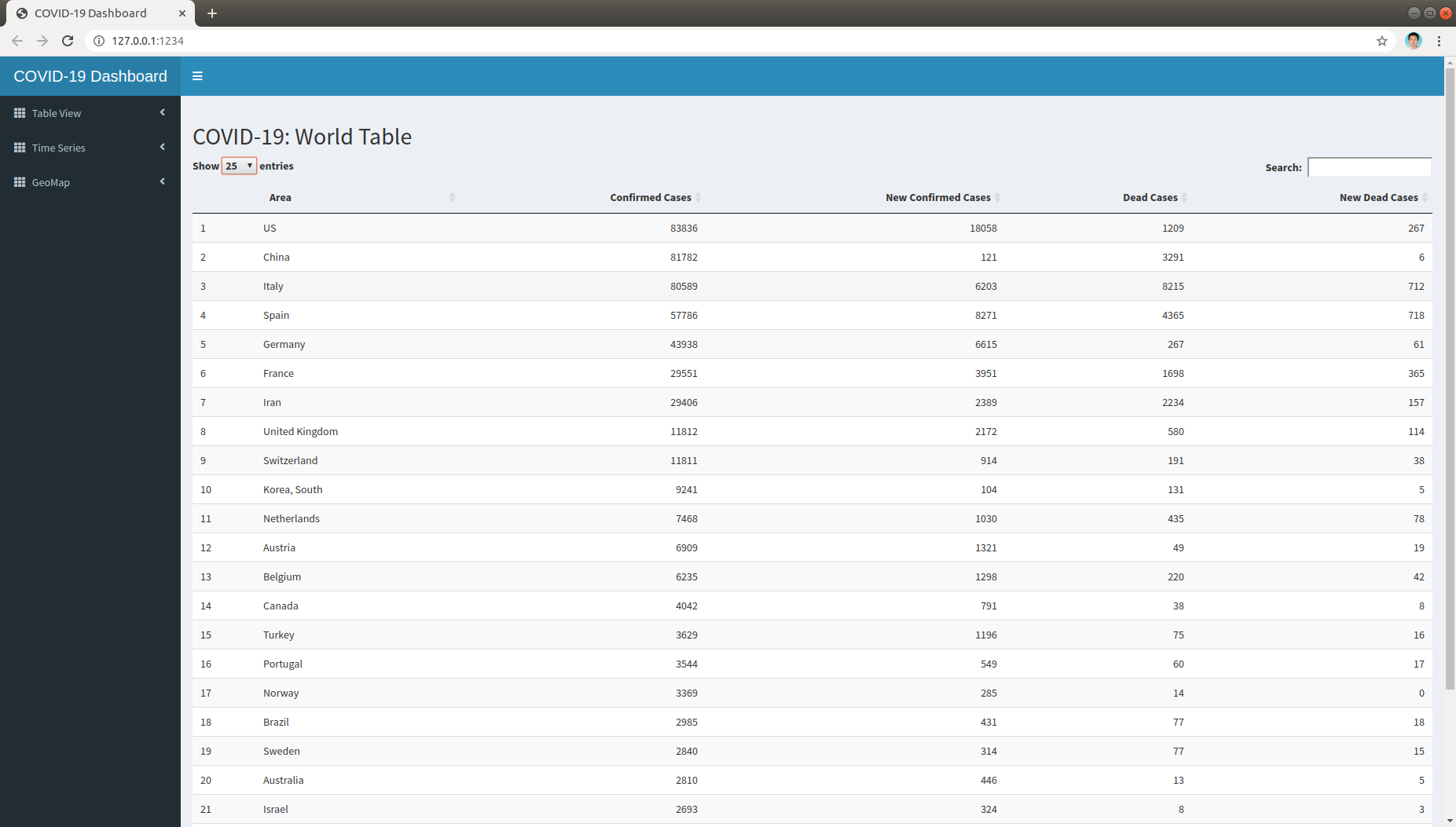
Time Series
Time series is the approach to demonstrate the trend of variables along the time line. One can clearly obtain the status of pandemic easily by checking the total confirmed/dead cases along time line.
Unlike the static table view, it would be a mess to demonstrate all countries all together on the same plot. Therefore, user can select the countries interested to demonstrate on the world time series plot. The user interface only demonstrate the data selected according to user input. A time series with selected countries set is shown below: 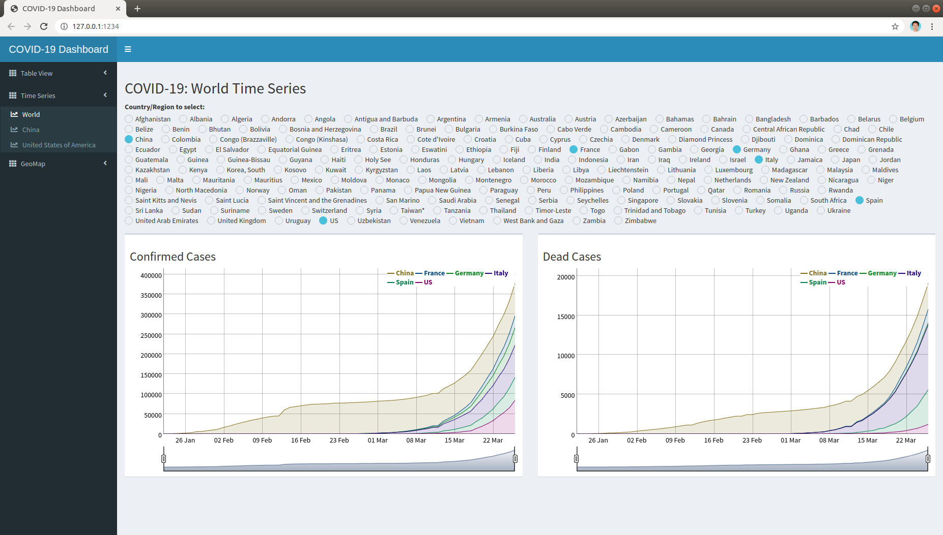
Geographic Map
Geographic map is the way to show the distribution of variable across geographic coordinates. The government and people at each country takes the major responsibility to prevent virus from killing people. Therefore, one can easy evaluate the performance of government by checking the confirmed and dead cases per 1 million population. Moreover, the disease evolution along time line can be viewed by a slider bar day by day. A screenshot on total confirmed cases per 1 million people of the world map is listed below: 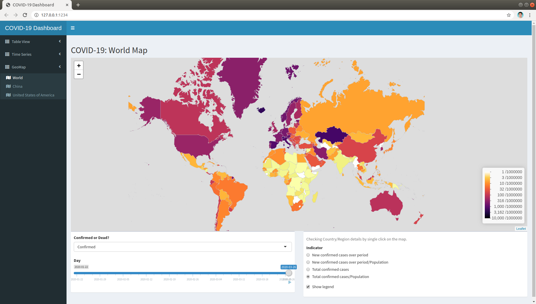
Conclusion
In this blog, an application for COVID-19 visualization is demonstrated. The application have been deployed on this website through Shinyapps.io.